The Shed is a multidisciplinary cultural institution in New York City that opened in April 2019. Acting as a hub for both emerging and established artists, the building literally transforms itself—via its retractable outer shell—to accommodate a wide range of visual and performing arts. Other Means was commissioned to design The Shed’s visual identity, building signage, and seasonal campaigns.
In Front of Itself
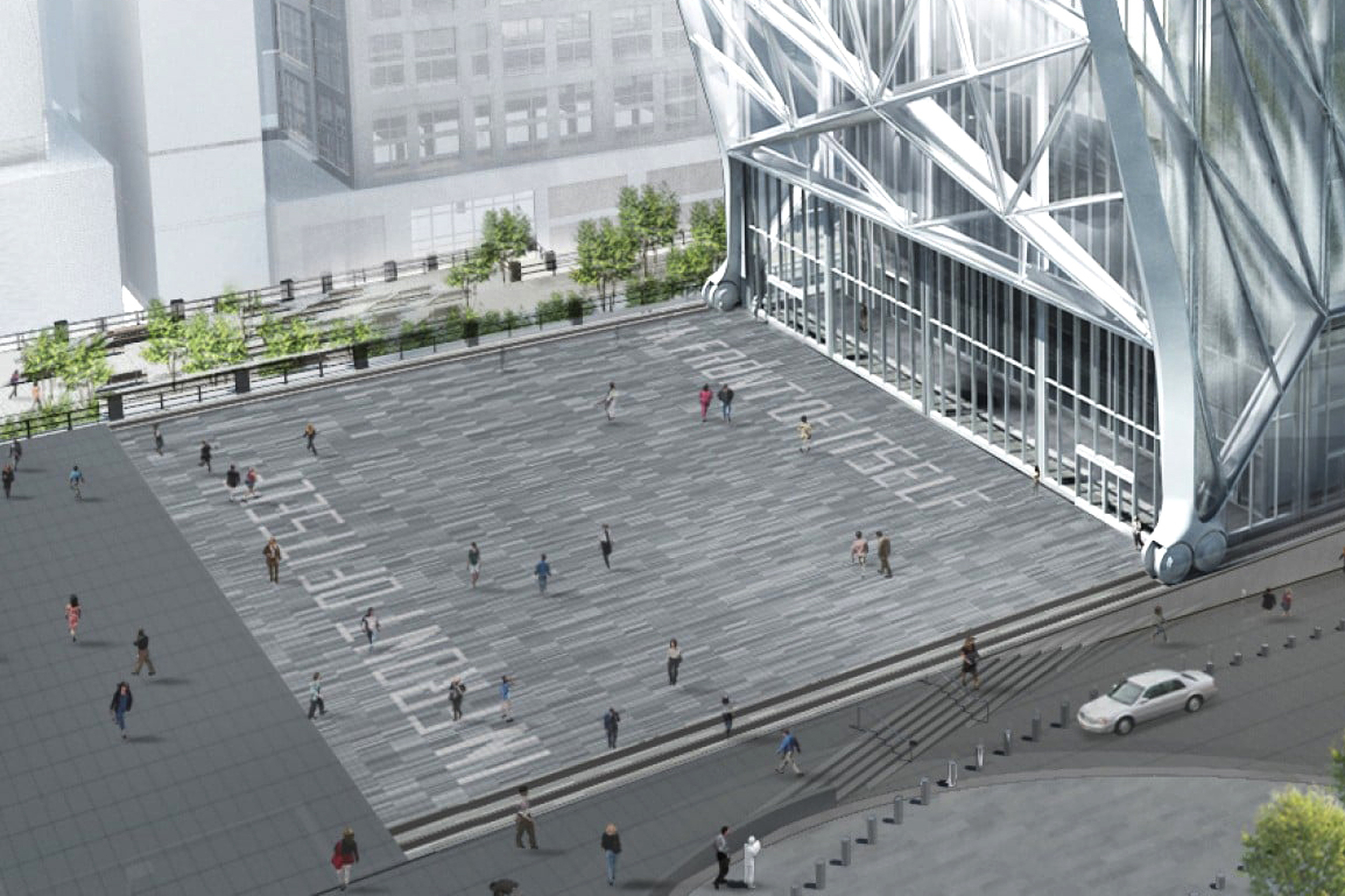
The Shed commissioned a new work by Lawrence Weiner, titled IN FRONT OF ITSELF, which would ultimately be installed in the building’s public plaza, become the institution’s logo, and serve as the starting point for a new visual language.
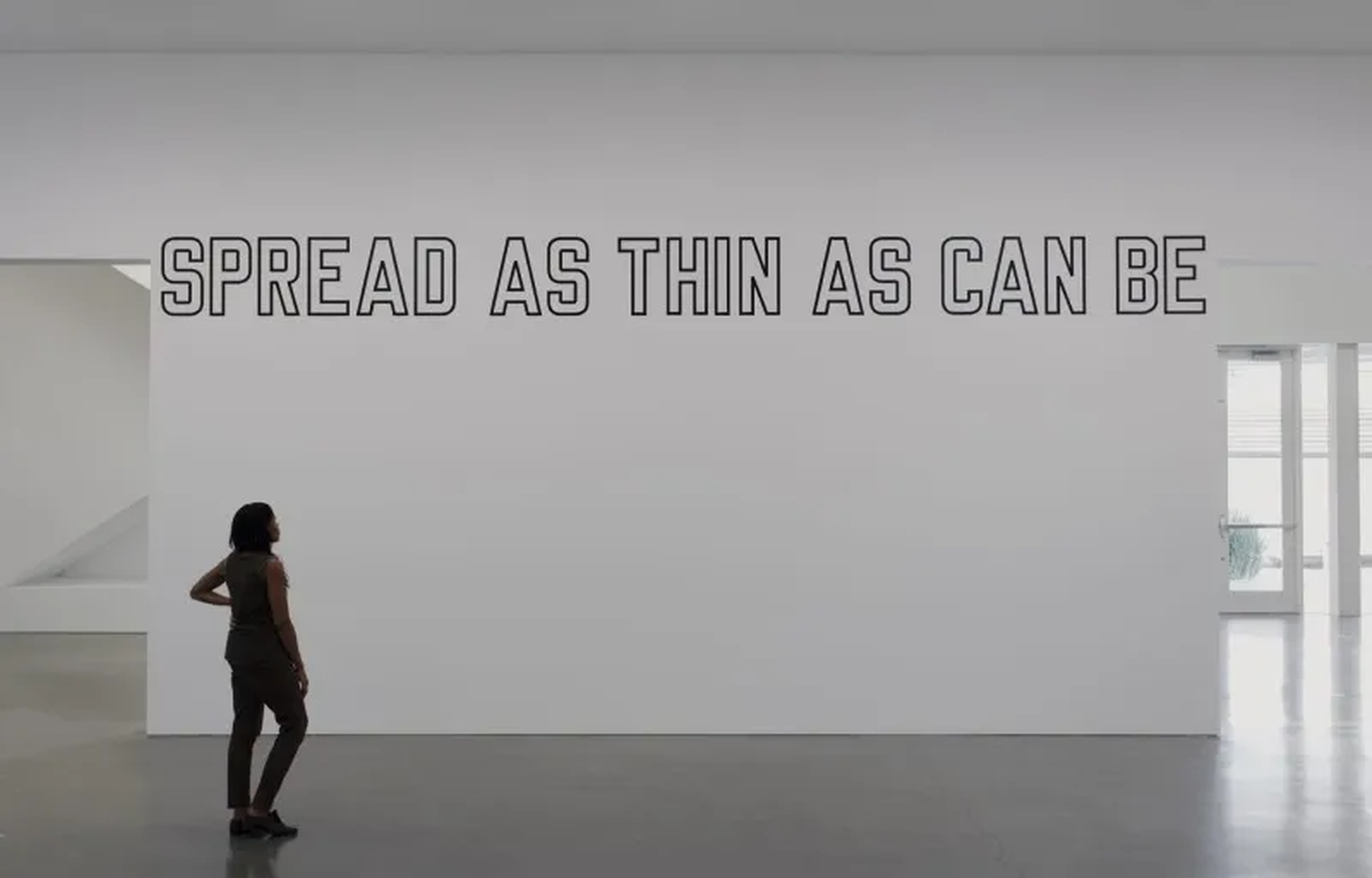
Since the 1960s, Weiner has used everyday language as his material to make what he referred to as “specific objects that have no specific form”—essentially prompts for potential sculptures.
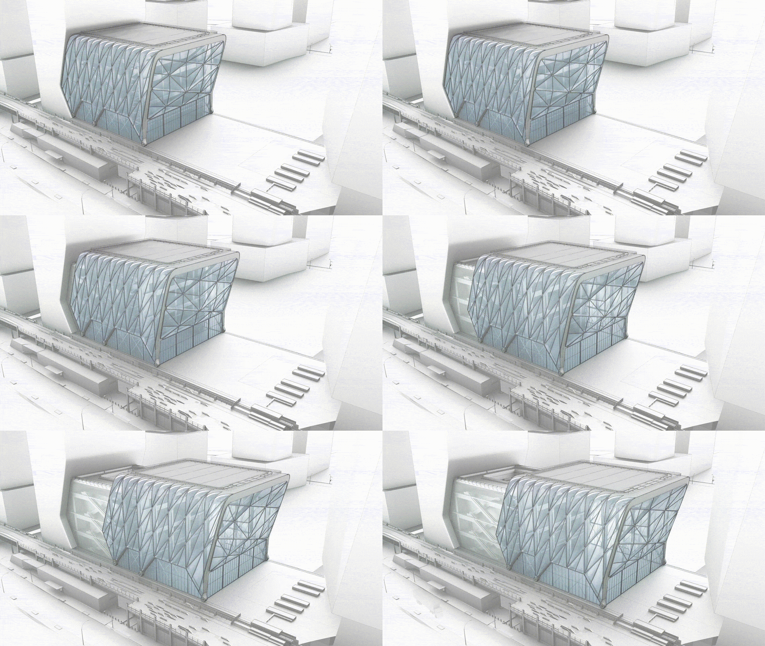
IN FRONT OF ITSELF suggests The Shed’s ability to move back and forth on its rails, and its commitment to looking toward the future. The work prompted a variety of design decisions—like movement, layering, stacking, depth, and dimension—that express The Shed’s mission to be an expansive and maximal institution.
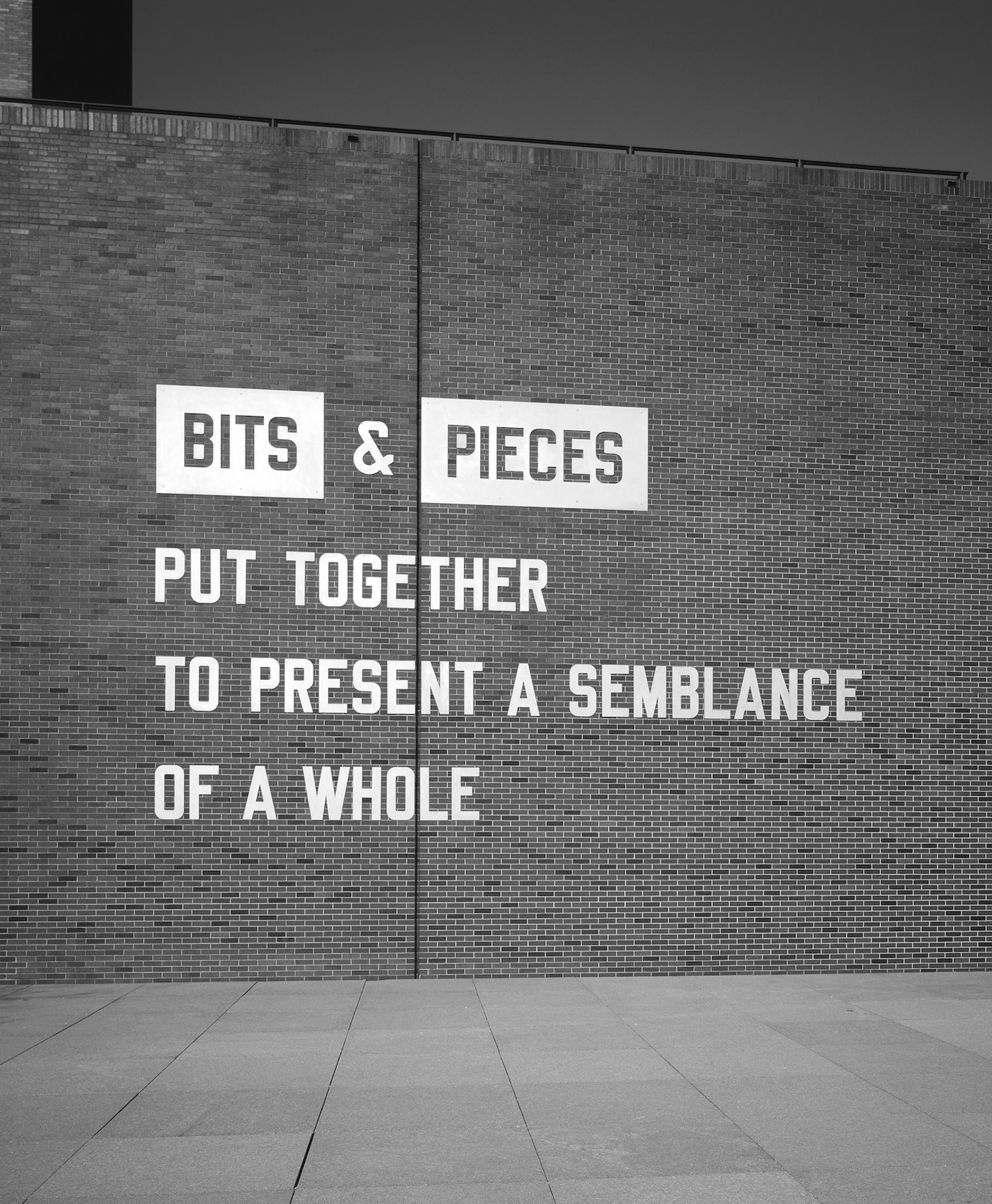
Frames, lines, and shapes are common elements in Lawrence Weiner’s work, often paired with typography to create hierarchy, reveal the structure of a text, and create objects from words.
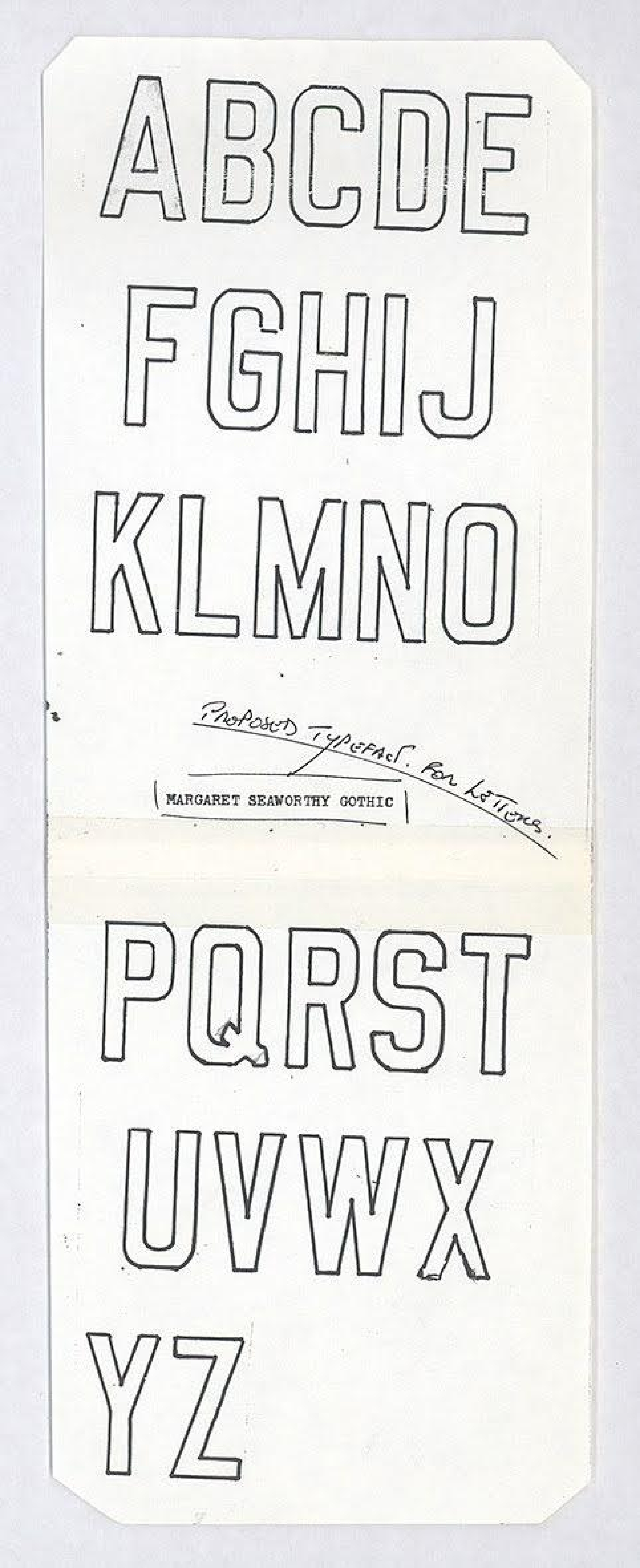
The Shed’s logo is typeset in Margaret Seaworthy Gothic (MSG), a typeface designed by Lawrence Weiner that has become a signature of his work. Weiner chose the outlined version of MSG because it suggested a container waiting to be filled—an allusion to The Shed as a venue for artists to present their work, and a nod to the fact that its mission had yet to be proven.
The Shed commissioned a new work by Lawrence Weiner, titled IN FRONT OF ITSELF, which would ultimately be installed in the building’s public plaza, become the institution’s logo, and serve as the starting point for a new visual language.
Since the 1960s, Weiner has used everyday language as his material to make what he referred to as “specific objects that have no specific form”—essentially prompts for potential sculptures.
IN FRONT OF ITSELF suggests The Shed’s ability to move back and forth on its rails, and its commitment to looking toward the future. The work prompted a variety of design decisions—like movement, layering, stacking, depth, and dimension—that express The Shed’s mission to be an expansive and maximal institution.
Frames, lines, and shapes are common elements in Lawrence Weiner’s work, often paired with typography to create hierarchy, reveal the structure of a text, and create objects from words.
The Shed’s logo is typeset in Margaret Seaworthy Gothic (MSG), a typeface designed by Lawrence Weiner that has become a signature of his work. Weiner chose the outlined version of MSG because it suggested a container waiting to be filled—an allusion to The Shed as a venue for artists to present their work, and a nod to the fact that its mission had yet to be proven.
The Shed commissioned a new work by Lawrence Weiner, titled IN FRONT OF ITSELF, which would ultimately be installed in the building’s public plaza, become the institution’s logo, and serve as the starting point for a new visual language.
Since the 1960s, Weiner has used everyday language as his material to make what he referred to as “specific objects that have no specific form”—essentially prompts for potential sculptures.
IN FRONT OF ITSELF suggests The Shed’s ability to move back and forth on its rails, and its commitment to looking toward the future. The work prompted a variety of design decisions—like movement, layering, stacking, depth, and dimension—that express The Shed’s mission to be an expansive and maximal institution.
Frames, lines, and shapes are common elements in Lawrence Weiner’s work, often paired with typography to create hierarchy, reveal the structure of a text, and create objects from words.
The Shed’s logo is typeset in Margaret Seaworthy Gothic (MSG), a typeface designed by Lawrence Weiner that has become a signature of his work. Weiner chose the outlined version of MSG because it suggested a container waiting to be filled—an allusion to The Shed as a venue for artists to present their work, and a nod to the fact that its mission had yet to be proven.
System
The Shed’s visual language consists of three components—a logo, a graphic vocabulary of shapes and lines, and a typeface—that follow a simple set of rules for how they can be used together.
Type as Material
A new typeface was commissioned for The Shed’s visual identity that continues the trajectory of typefaces Lawrence Weiner used in his work. Margaret Seaworthy Gothic and FF Offline exaggerate the industrial vernacular they derive from; Franklin Gothic has come to represent a kind of hardworking Americanness. In the same spirit, The Shed’s typeface, designed by Kasper Pyndt Rasmussen, takes full advantage of the digital tools that created it.
Franklin Gothic Extra Condensed

Margaret Seaworthy Gothic

FF Offline

If Weiner’s typography recalls the everyday, industrial vernacular of a previous era, The Shed’s typeface feels distinctly of our time. The most identifiable feature is its prominent ink traps—a functional device that ensures proper fidelity when text is printed at small sizes. In the display weight of The Shed’s typeface, they are an anachronistic detail that veers toward parody. An expressive decoration fitting for a building on wheels.
Shed Display Thin, Regular, Bold, and Heavy

The ink traps have a relationship to the line weight of The Shed’s logo and the enclosures that form The Shed’s visual language. They resemble the outlined and filled versions of Margaret Seaworthy Gothic, suggesting a line that has been removed around the letterforms.


Enclosures
The Shed’s building was designed with infrastructure (lighting, sound, walls, etc.) that adapts to the needs of artists producing ambitious new works. Similarly, the lines and frames in The Shed’s visual language don’t follow a prescribed use of space. They serve both function and decoration, expressing ideas, energy, and movement as much as they organize information.
A comprehensive suite of icons was developed for wayfinding, signage and The Shed’s website. Two versions exist: one with an outlined stroke, designed in proportion to line weights in the building’s wayfinding, and an editable version that can be scaled so the stroke matches the line weight of each application.
The Shed’s visual identity is primarily typographic. Like the building, it operates in black and white. Color is introduced through the art and artists who fill the galleries and theaters each season. For applications without art-directed images, a color palette was developed based on five vibrant colors from across the spectrum.
The Shed’s palette includes a range of grays that create a gradation recalling the volume and reflection of the inflated ETFE of the building’s outer shell. This is further communicated through the use of raw materials like chipboard and metallic paper, and extended to the building’s signage system, where messages extrude from the walls and are pressed beneath the surface.

Applications

Wayfinding, Signage and Digital Displays


Printed Materials and Programs


Social Media
Cedric’s at The Shed


Merchandise


