Matthew Marks, founded in 1991, is a contemporary art gallery with locations in Chelsea and West Hollywood. In 2020, Other Means designed and developed a new website for the gallery that distills its use of typography over its thirty-year history and provides tools to build robust online exhibitions, create consistent artist and exhibition pages, and maintain an online store.
Consistency as Identity
Since its founding in 1991, Matthew Marks has employed a consistent typographic palette across its announcements, publications, and signage.
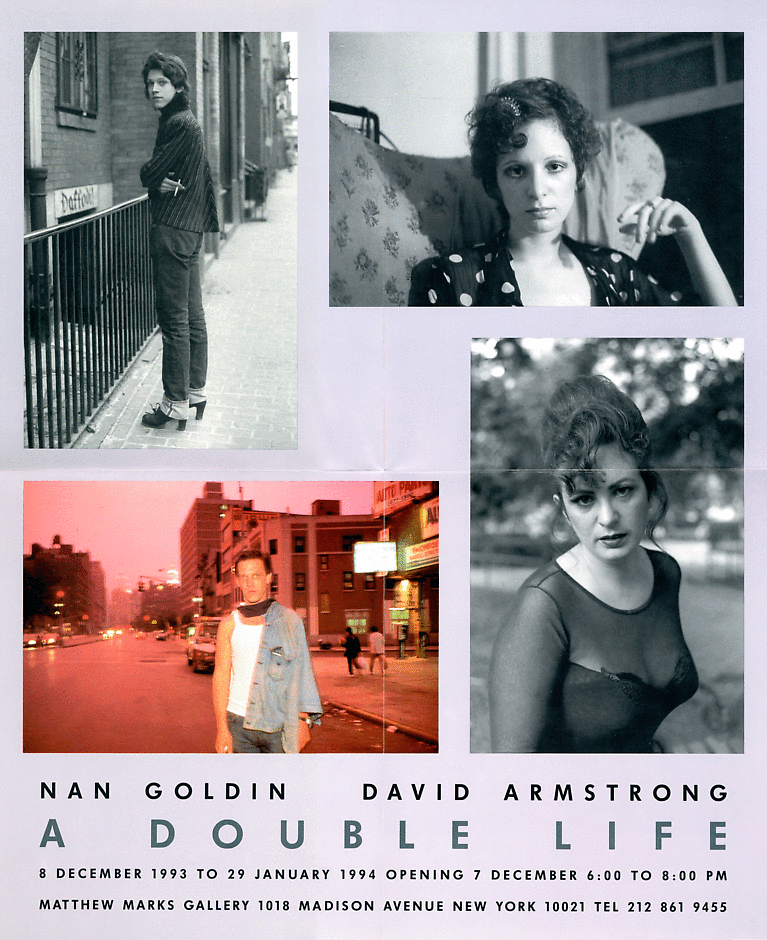
Before starting the gallery, Matthew Marks interned with Massimo Vignelli, who famously encouraged designers to limit themselves to five typefaces (Bodoni, Helvetica, Futura, Times, and Century). The gallery mostly adhered to this principle, using Vignelli’s recommendations and adding a few outliers to serve the needs of an artist or exhibition.
The two typefaces the gallery used the most—Centaur and Gill Sans—were not on Vignelli’s list. Centaur was chosen with a letterpress printer who produced the gallery’s first announcements and stationery, and it went on to become their de facto identity. The redesign takes this established vocabulary as its starting point, extending it into a comprehensive visual language that works well across their digital communications.
Since its founding in 1991, Matthew Marks has employed a consistent typographic palette across its announcements, publications, and signage.
Before starting the gallery, Matthew Marks interned with Massimo Vignelli, who famously encouraged designers to limit themselves to five typefaces (Bodoni, Helvetica, Futura, Times, and Century). The gallery mostly adhered to this principle, using Vignelli’s recommendations and adding a few outliers to serve the needs of an artist or exhibition.
The two typefaces the gallery used the most—Centaur and Gill Sans—were not on Vignelli’s list. Centaur was chosen with a letterpress printer who produced the gallery’s first announcements and stationery, and it went on to become their de facto identity. The redesign takes this established vocabulary as its starting point, extending it into a comprehensive visual language that works well across their digital communications.
Since its founding in 1991, Matthew Marks has employed a consistent typographic palette across its announcements, publications, and signage.
Before starting the gallery, Matthew Marks interned with Massimo Vignelli, who famously encouraged designers to limit themselves to five typefaces (Bodoni, Helvetica, Futura, Times, and Century). The gallery mostly adhered to this principle, using Vignelli’s recommendations and adding a few outliers to serve the needs of an artist or exhibition.
The two typefaces the gallery used the most—Centaur and Gill Sans—were not on Vignelli’s list. Centaur was chosen with a letterpress printer who produced the gallery’s first announcements and stationery, and it went on to become their de facto identity. The redesign takes this established vocabulary as its starting point, extending it into a comprehensive visual language that works well across their digital communications.
The design of Matthew Marks’ website draws from the gallery’s longstanding use of typography, formalizing its de facto identity—used across stationery, announcements, and signage—into a flexible, digital-first visual language continuous with its history.

Typography
While Centaur and Gill Sans have long defined the gallery’s primary communications, other typefaces have been used to serve the needs of an artist or exhibition. To maintain this approach, the website was built with templates that allow different typefaces and alignments to be deployed to suit the context.
Website
Matthew Marks’ website presents the gallery’s artists, exhibitions, and an online shop in a consistent visual language and restrained user interface.
Online Exhibitions
In addition to designing templates for traditional artist and exhibition pages, we developed custom tools for gallery staff to craft flexible online exhibitions. Each online presentation is a unique editorial space, combining artwork photography with other research materials, and allowing for a deep dive into the history and context of a single work or a larger collection.
Actual-Size Artwork Viewing
Continuing to push the format of the virtual viewing room, we collaborated with the artist Wade Guyton to develop an immersive online component for a show of new paintings. The custom tool allowed users to tap on a specific point on any painting to view it in actual size, scaling precisely to their device, and drag it around to explore the work at a 1:1 scale.
Publications and Shop
The website integrates publications into the broader experience of the gallery, presenting catalogs, posters, and editions within the same editorial framework as artists and exhibitions.