

Facade of the Brooklyn Museum (Sep, 2024)
The Brooklyn Museum, founded in 1823, is a New York institution distinguished for its diverse and inclusive approach to art. Housed in a stately Beaux-Arts building in the heart of Brooklyn, the museum boasts an eclectic collection that spans from ancient civilizations to contemporary art. On the occasion of the museum’s 200th anniversary, Other Means designed a new identity for the Brooklyn Museum that brings together its layers of history into one visual language.
The People’s Museum
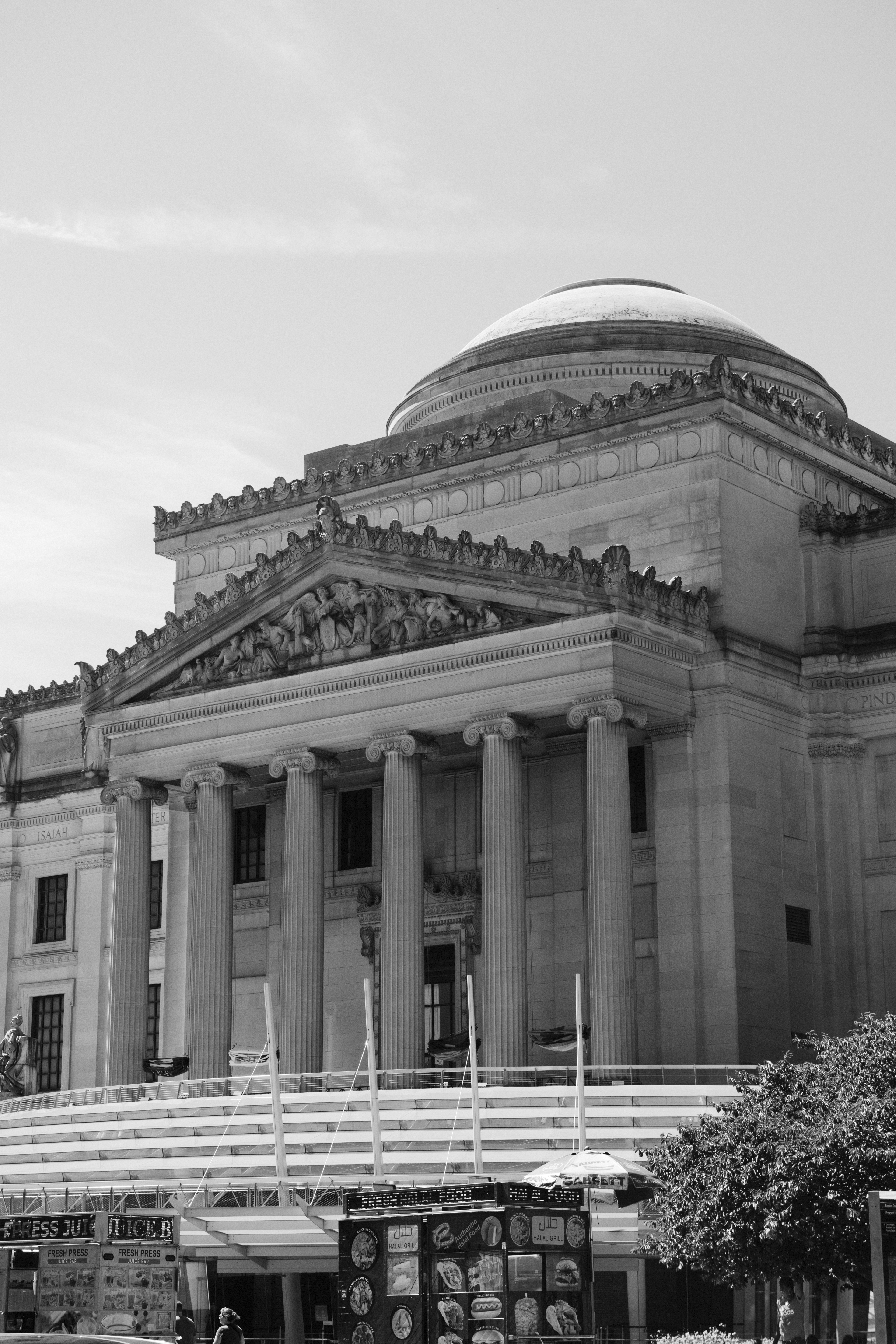
The museum’s rotunda sits above six grand columns that support a sculptural relief symbolizing the Institute’s commitment to the arts and sciences.

Modernism was being embraced as an honest, populist alternative because of its rejection of ornamentation and embrace of everyday materials. The museum’s director led a campaign to modernize the building, starting with the removal of the grand staircase, and followed by stripping the interiors of all decorative flourishes.
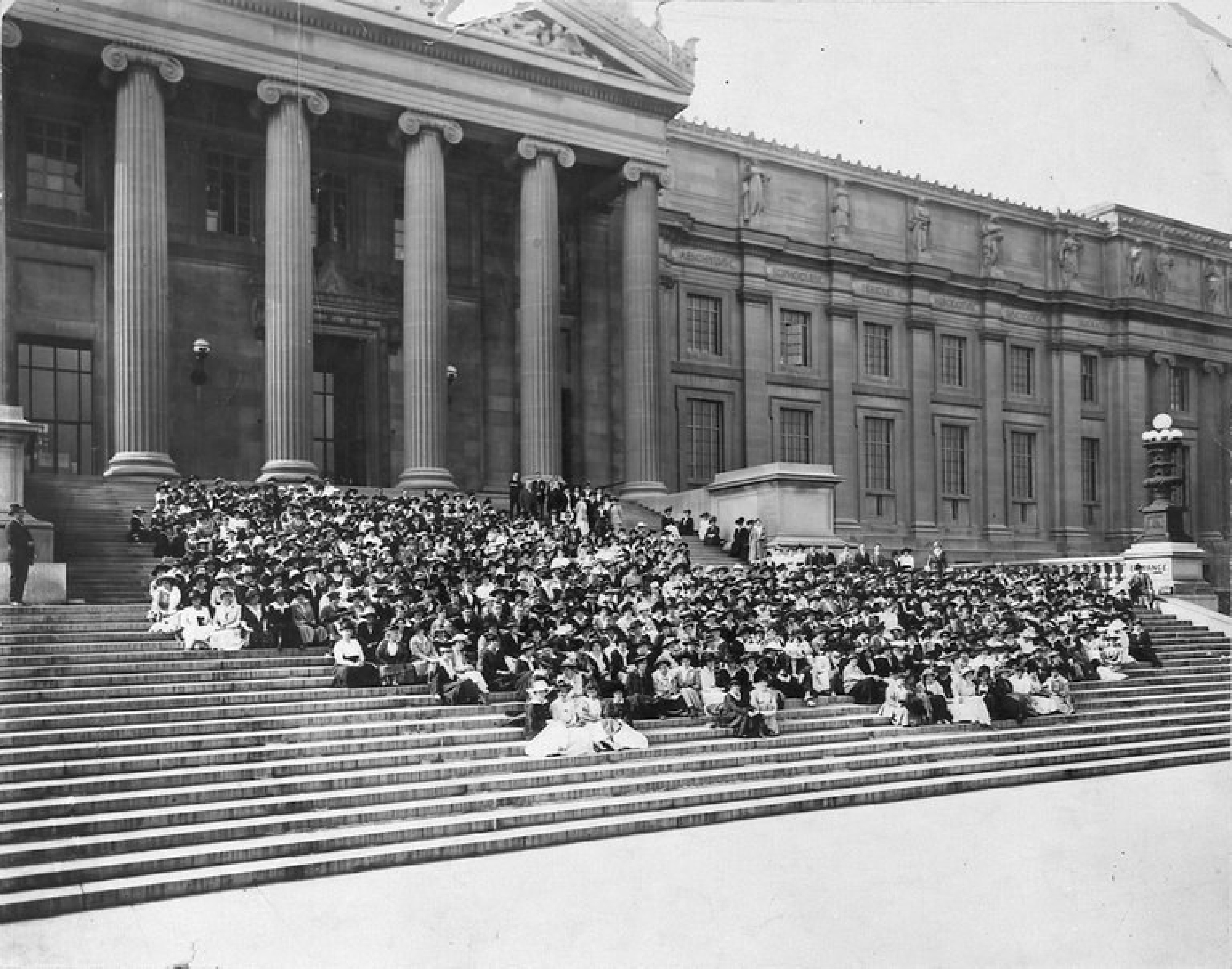
Designed by McKim, Mead & White and opened in 1897, the Brooklyn Museum’s original entrance sat atop a grand neoclassical staircase. During the 1930s, as the Great Depression deepened, buildings like the Brooklyn Museum’s became symbols of an elite, undemocratic ruling class.
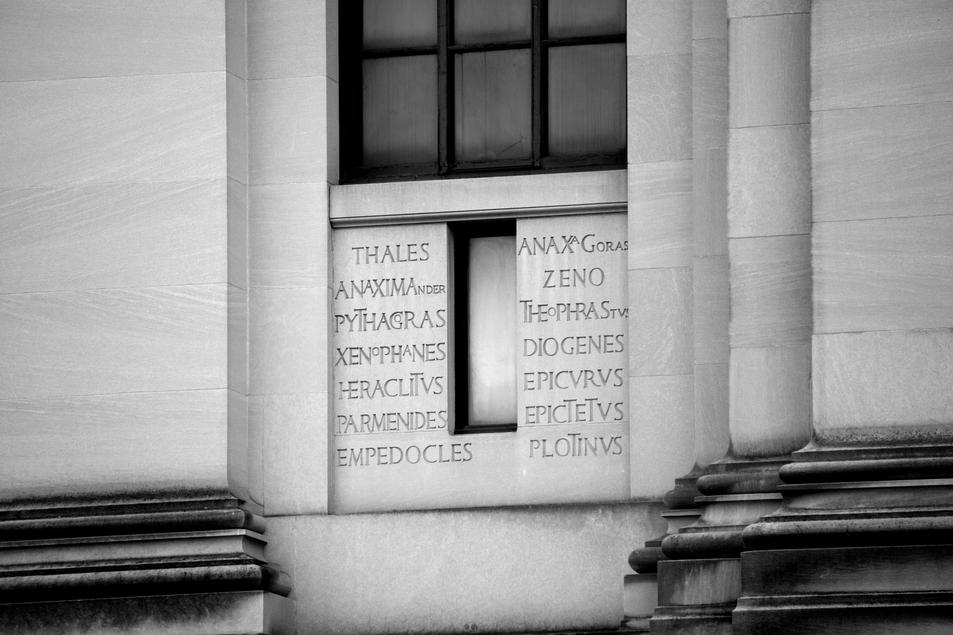
Across the limestone facade, names of ancient philosophers, playwrights, and poets are engraved in Roman letterforms that overlap and intertwine with ornamental ligatures.
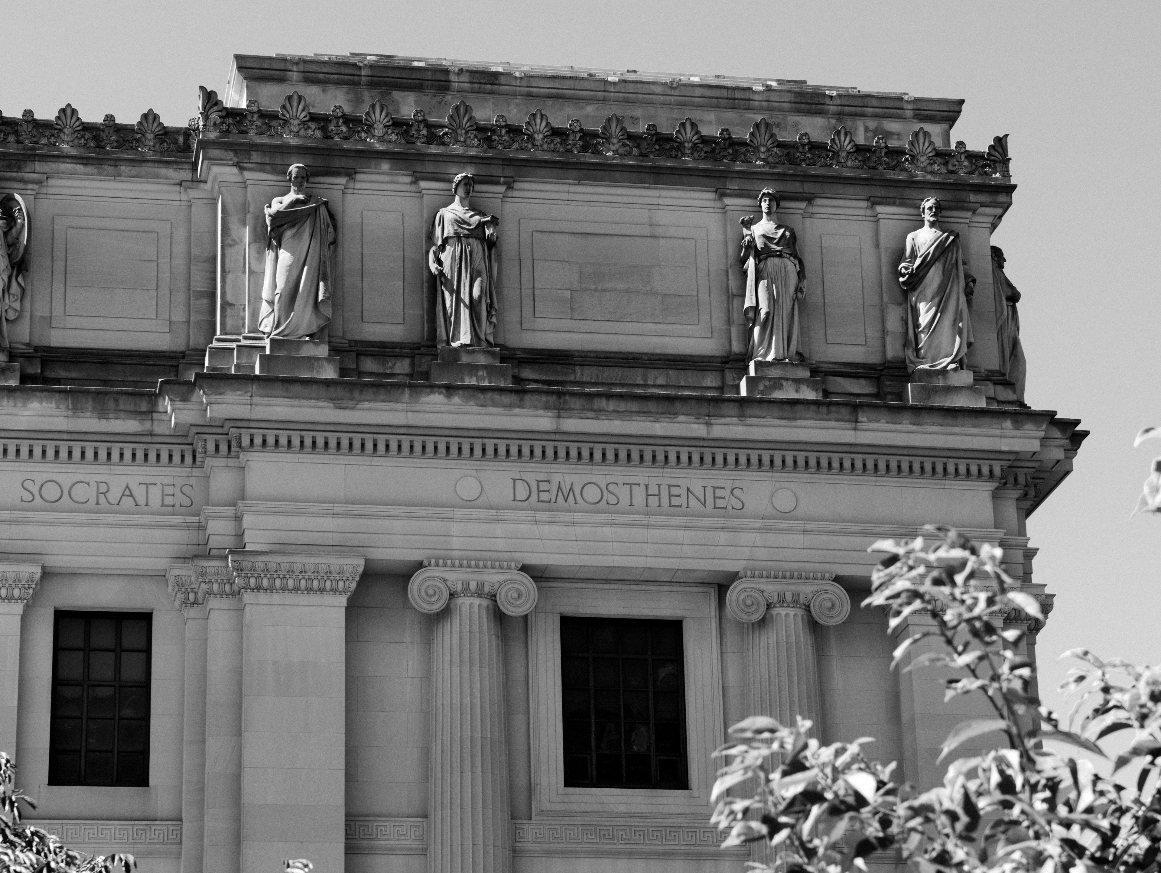
Higher up, a frieze that wraps the facade features the most significant names in tall capital letters bracketed by two large, solid dots.
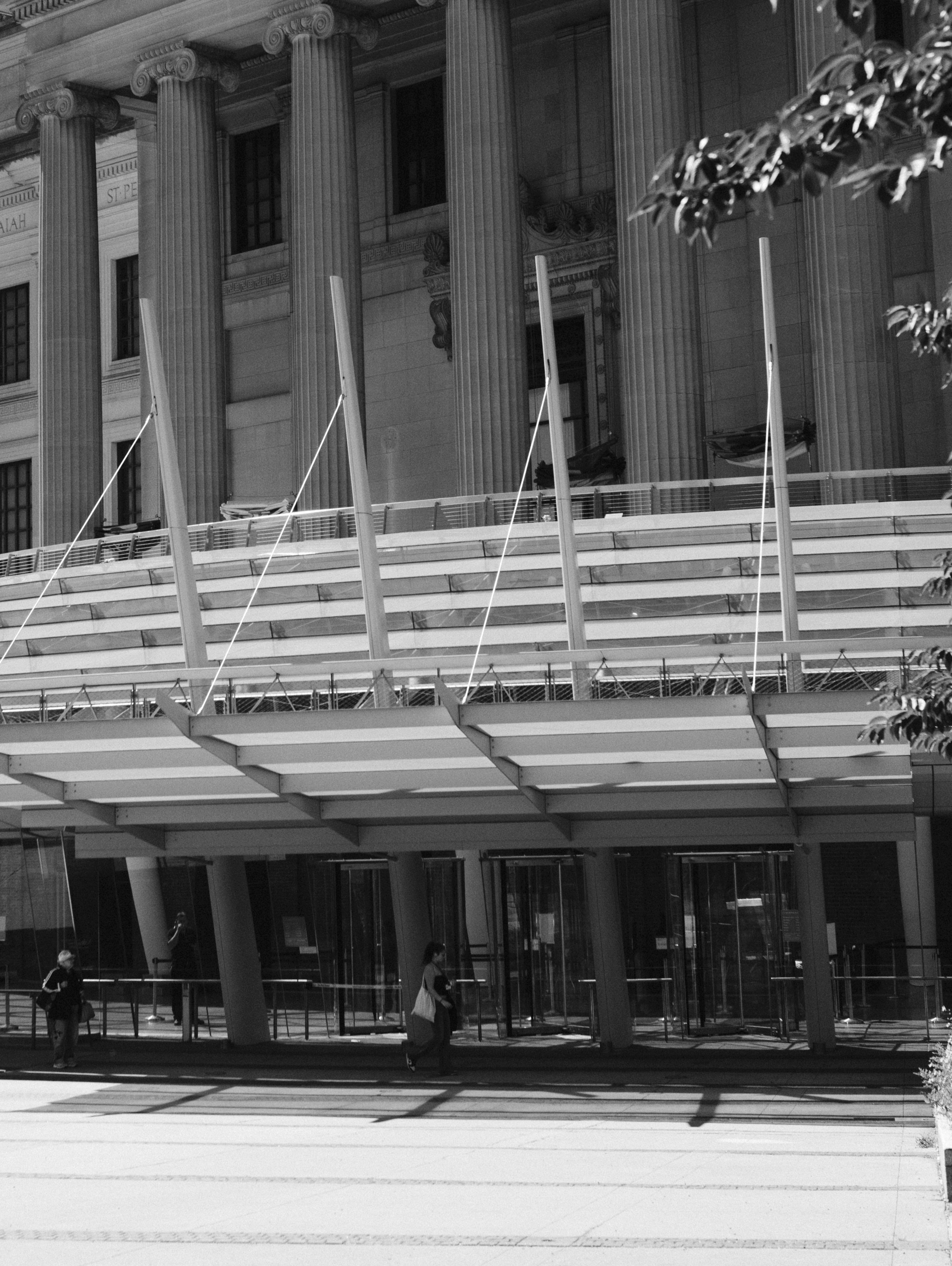
Visitors enter the Brooklyn Museum through a ground-level pavilion that was added in 2005. It feels out of place and stuck-on, and stands in stark contrast to the rest of the building.
This is the first encounter visitors have with the Brooklyn Museum, whose building and collection tell a vivid story of the past colliding with the present.
The museum’s rotunda sits above six grand columns that support a sculptural relief symbolizing the Institute’s commitment to the arts and sciences.
Modernism was being embraced as an honest, populist alternative because of its rejection of ornamentation and embrace of everyday materials. The museum’s director led a campaign to modernize the building, starting with the removal of the grand staircase, and followed by stripping the interiors of all decorative flourishes.
Designed by McKim, Mead & White and opened in 1897, the Brooklyn Museum’s original entrance sat atop a grand neoclassical staircase. During the 1930s, as the Great Depression deepened, buildings like the Brooklyn Museum’s became symbols of an elite, undemocratic ruling class.
Across the limestone facade, names of ancient philosophers, playwrights, and poets are engraved in Roman letterforms that overlap and intertwine with ornamental ligatures.
Higher up, a frieze that wraps the facade features the most significant names in tall capital letters bracketed by two large, solid dots.
Visitors enter the Brooklyn Museum through a ground-level pavilion that was added in 2005. It feels out of place and stuck-on, and stands in stark contrast to the rest of the building.
This is the first encounter visitors have with the Brooklyn Museum, whose building and collection tell a vivid story of the past colliding with the present.
The museum’s rotunda sits above six grand columns that support a sculptural relief symbolizing the Institute’s commitment to the arts and sciences.
Modernism was being embraced as an honest, populist alternative because of its rejection of ornamentation and embrace of everyday materials. The museum’s director led a campaign to modernize the building, starting with the removal of the grand staircase, and followed by stripping the interiors of all decorative flourishes.
Designed by McKim, Mead & White and opened in 1897, the Brooklyn Museum’s original entrance sat atop a grand neoclassical staircase. During the 1930s, as the Great Depression deepened, buildings like the Brooklyn Museum’s became symbols of an elite, undemocratic ruling class.
Across the limestone facade, names of ancient philosophers, playwrights, and poets are engraved in Roman letterforms that overlap and intertwine with ornamental ligatures.
Higher up, a frieze that wraps the facade features the most significant names in tall capital letters bracketed by two large, solid dots.
Visitors enter the Brooklyn Museum through a ground-level pavilion that was added in 2005. It feels out of place and stuck-on, and stands in stark contrast to the rest of the building.
This is the first encounter visitors have with the Brooklyn Museum, whose building and collection tell a vivid story of the past colliding with the present.
System
The Brooklyn Museum’s new typeface incorporates ornamental ligatures into a neutral sans serif, reenacting the tension between the building’s architecture, the museum’s historic collection, and its contemporary exhibitions. This is most noticeable in the museum’s logo, where the double-Os in BROOKLYN intertwine and the Ms and Us in MUSEUM converge. Two prominent dots, pulled from the building’s facade, activate the identity by framing text, creating hierarchy, and informing a spacing logic behind every application.
The presence of decorative and functional ligatures, along with geometric alternates, allows the visual language to communicate across a range of volumes—from expressive headlines to straightforward texts. The typeface also contains a robust array of diacritics for native languages and an expansive set of numerals, fractions, and arrows.
BKM Facade

Specimen

OpenType features

Discretionary Ligatures
The dots reference the circles that frame the names of scholars and artists on the building’s facade and echo the adjoining Os in BROOKLYN. At least two are used in every application to create hierarchy, activate motion graphics, hold arrows and icons in signage, and inform grids and spacing logic.
Functional dots create grids and define space
Dots are a tool for creating hierarchy. For certain applications they can be replaced with illustrative circular symbols like buttons, clocks, smileys, suns, moons, or splats. In plain text they can be rendered with emojis.
Decorative dots amplify the Museum’s voice
The Brooklyn Museum’s color palette is a brighter version of a standard color wheel. This signals that despite its esteemed age and the depth of its historical collection, the museum is a contemporary institution. The addition of black, white, and three gray values, which represent the limestone building, expands the range and balances the saturated palette.
Color Palette


Applications

Didactics


Uniforms and Merchandise


